It’s time to put fall to bed and prepare for winter. We’ve stored the lawn furniture and emptied the flower pots. The hoses are unhooked, the taps insulated. The garden is tidy, and the flower beds weeded. We’re ready to slow down, tuck in, and open ourselves to quieter, shorter days.

The leaves changed unevenly this year. Black walnut turned first, soft yellow sifting thinly to carpet the grass. The sugar maples added a brief, showy red, while silver maples clung to their green until the last moment. We spent the peak time for leaves in Brown County, Indiana, poking through shops and hiking at the state park. We came home to find a few scattered oranges among somber oaks.

After two decades in Colorado, enjoying fall Aspen, the color that startles me is the fluorescent peach of sassafras leaves. Even in the gloom of a winter afternoon, with the sun setting before 5 pm, the sassafras somehow gleam in the shadows. Above them, the setting sun casts pinks and lavenders against ragged clouds.

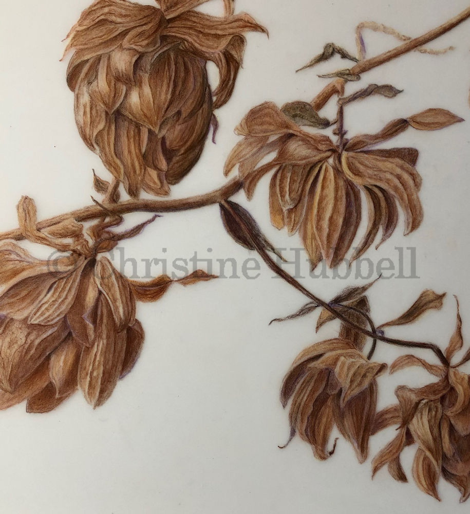
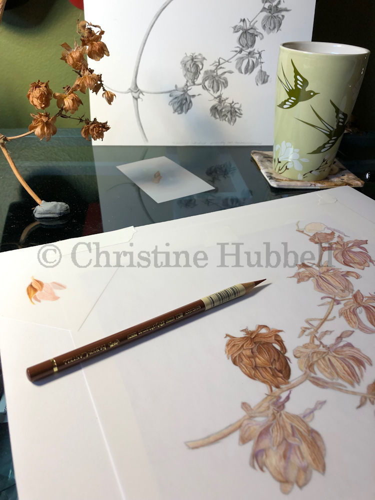
Much more somber, the oak leaves are raining down even as they persist in the canopy. As kids, we raked those heavy leaves every fall, making giant piles for jumping into or piling over each other. The scratchy bits, and a few insects, would find their way down the backs of shirts and pants. Looking up through a blanket of brown leaves, I would watch the contrails of airplanes spreading out, white against blue. Those memories are carried back to me on the scent of warm leaves and acorns crunching underfoot.
There’s a wonderful space available in the weeks before Thanksgiving. In that space we can take a breath, take a walk, and watch the scattering leaves fall like snow.